
Sarah opened her client metrics spreadsheet and stared at it — trying to make sense of what she was looking at.
The spreadsheet still resembled the template they had originally shared with a client to use, but the client moved a few things around, highlighted the parts important to her, and got rid of the items she didn’t feel applied to her.
Sarah felt that she needed a couple of minutes to decompress to be able to come back to the metrics spreadsheet and evaluate the client’s results.
Having the clients regularly update Sarah’s team about their progress and fill out their metrics spreadsheets was a battle that they’ve finally won.
But the fact that these spreadsheets looked so different one from another was making it insanely difficult for Sarah to easily read the data and quickly spot problem areas.
Sarah greatly appreciates her clients but, at that moment, she couldn’t help but be annoyed that not all of them were following the directions. It is such a challenge to have the clients report back their data but now, those who did were personalizing their spreadsheets to the point they were unrecognizable.
“The point of tracking data is not to track whatever numbers you feel like tracking.” Sarah thought. “The point of tracking data is to give us answers, to guide our decisions. It helps us see what works and what doesn’t, so we can do more of what works and improve/outsource/stop doing what doesn’t work. Don’t they get it?”
Sarah got off her imaginary soapbox, took a deep breath, and opened the metrics spreadsheet again. “Could there be a better way?” was Sarah’s last fleeting thought before she immersed herself into the client’s data.
Love-hate relationship with spreadsheets
At SystemsRock, we adore clients, like Sarah, who has a love-hate relationship with their metrics spreadsheets.
On the one hand, they can’t live without them because the data they derive from those spreadsheets allows them (and their clients!) to make rapid progress.
On the other hand, they find it intolerable that maintaining those spreadsheets is such a drag, that their team needs to update the same data in multiple locations, and that there is not always an easy way to read that data.
That’s where we come in and transform our clients’ metrics dashboards into their “forever happy places.” 😀
One of the clients whose metrics dashboards we’ve recently transformed was Jessica Nazarali. Jessica and her team offer a done-for-you service where they work alongside their online service-based clients to fill their client pipeline. It entails building and executing a lead generation and sales system which is, as they say, “a numbers game.”
Playing with the numbers
To keep track of the numbers and deliver her clients results faster, Jessica and her team developed a series of spreadsheets that allow them to track:
- The progress of their clients — to quickly spot areas where the client needs hand-holding
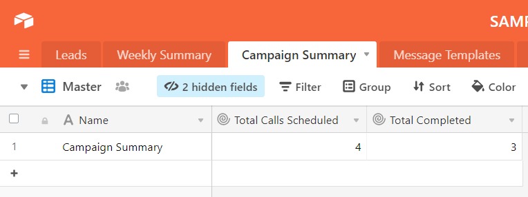
- The performance of the entire campaign — to be able to adjust their strategy as necessary
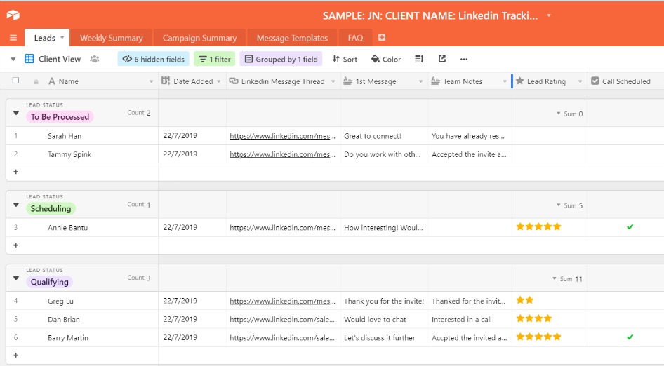
- The client’s leads — so that it’s easy for the client to see what action needs to be taken with each lead
Jessica’s spreadsheets were incredible. However, maintaining those spreadsheets was time-consuming and the data was challenging to digest quickly, especially if the client made changes to it.
However, the biggest problem was that consolidating all of the data made the spreadsheets very busy. Jessica’s team cares about one set of numbers to drive their efforts and better guide the client, while Jessica concentrates on another set of numbers to draw her conclusions and ensure that they hit their goals. So, when reading the data, Jessica needed to ignore some numbers, and her team—others.
From busy to beautiful
When Jessica outlined the challenges they were experiencing with the spreadsheets, we immediately knew that a beautiful Airtable base will be a game-changer for them! The bases we’ve configured for Jessica and her team ticked all the boxes.
Though the internal metrics base still tracked all critical numbers, it had:
- Separate views for Jessica and her team, so that they can see at a glance only the numbers they care about.
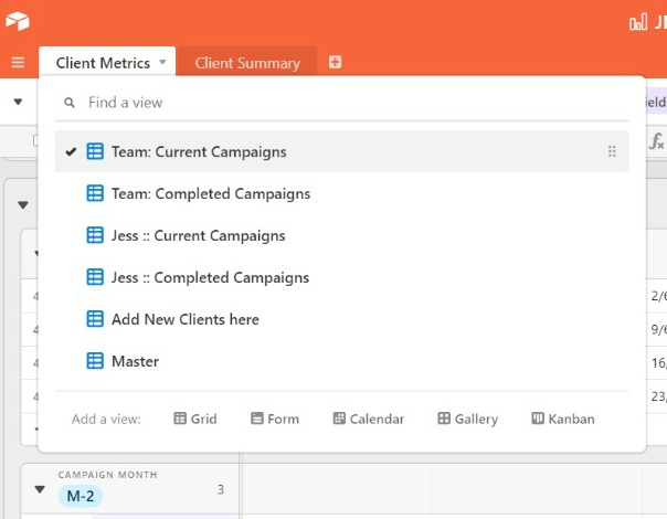
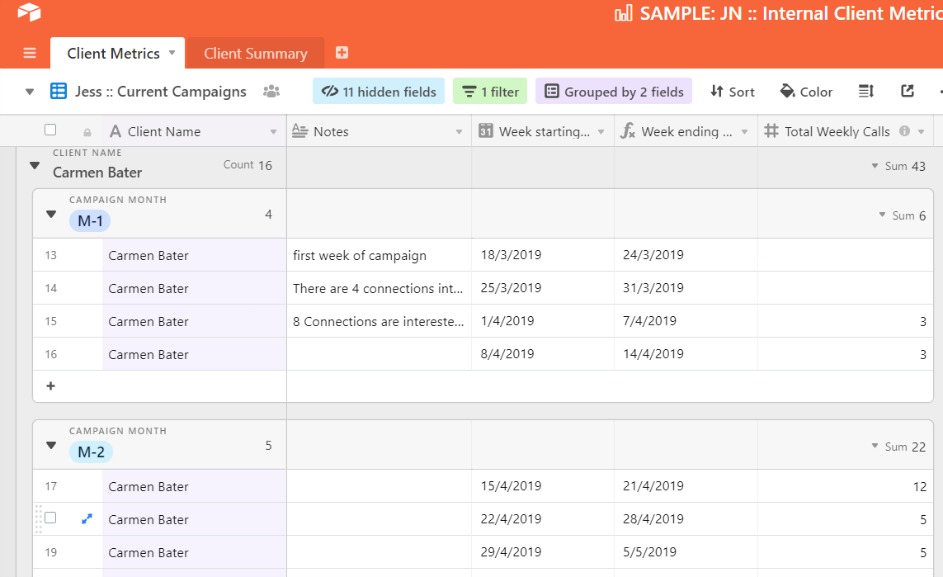
- Client numbers are grouped by campaign. Now everyone can easily zoom in on the numbers of individual clients and see each client’s weekly and monthly progress.
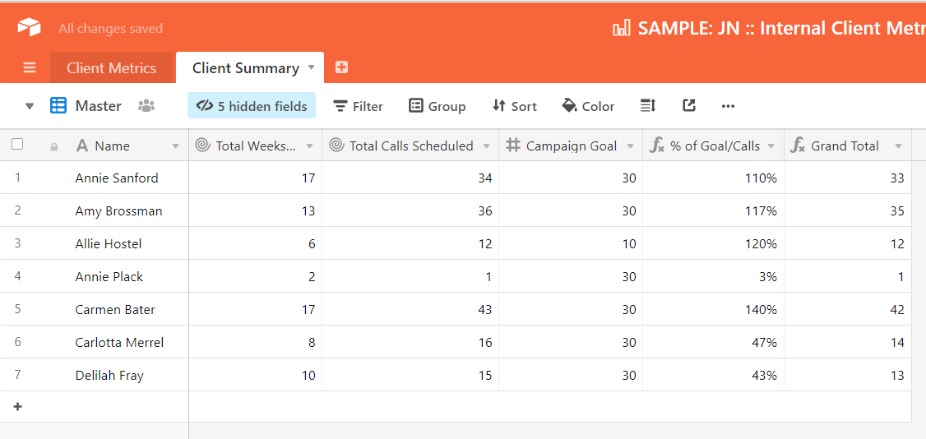
- A client summary table where the team can zoom out on all clients’ data. What’s cool is that the table is set up in a way that the clients’ critical metrics are added and the percentage to client goal is calculated in real-time!
The tracker base for the clients got a makeover as well:
- Jessica’s team got a separate view to add in the new leads and the clients have their own view to track them. Creating a separate view for the team allowed us to make the client’s view cleaner and simpler isolating only those data points the clients cared about and/or needed to track.
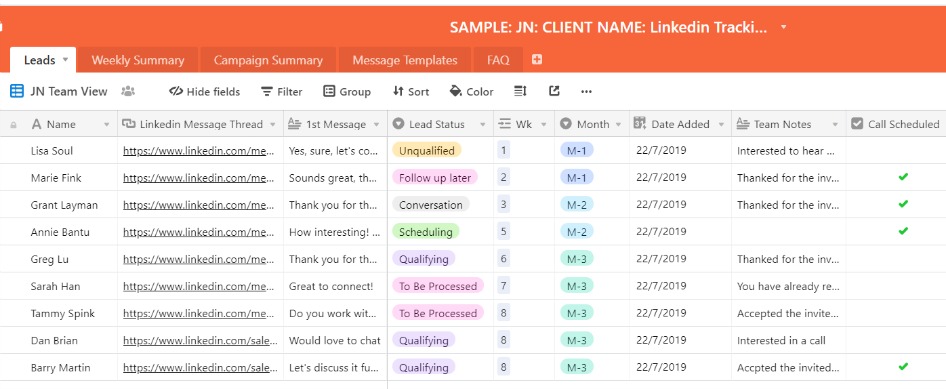
- We simplified the way Jessica’s clients will keep track of the incoming leads by categorizing them so that they immediately know what action they need to take. We’ve created a space for client’ notes and allowed the clients to rate their leads. We expect these changes will significantly improve client experience and result in the clients’ not needing to reorganize their spreadsheets. At the same time, since we are pulling the campaign numbers to a different table, the client personalizing their spreadsheets won’t throw anyone off anymore 🙂
- We also implemented summary tables that calculate the numbers on a weekly basis and for the entire campaign, giving the client a bird’s eye view of her results. These tables are super handy to Jessica as well when she walks the client through the results of the campaign and explains the strategy for the next phase.
“These Dashboards have been a major gamechanger for us” said Jessica Nazarali. “Now, all our key metrics are at our fingertips and in a format that’s super easy to read. It allows me to make decisions and spot areas where my attention is needed almost instantaneously! “
“It didn’t take long for our clients to embrace their Dashboards either. They rave about them! This simple tool helped us to take our client experience to a whole new level! It’s amazing that streamlining and automating things on the back end made our service even more high-touch, because it freed up our time for the things that truly make a difference to our clients — supporting them through the challenges they’ve hired us to help them solve.”
Metrics dashboards can feel annoying and may seem a waste of time to some. But to others, they are essential to understanding what actions cause what results.
Because as Richard Koch, the author of The 80/20 Principle, put it: “If we did realize the difference between the vital few and the trivial many in all aspects of our lives, and we did something about it, we could multiply anything that we valued.”
Do you love numbers and spreadsheets, but are struggling to organize them in a way that allows you to make sense of your data quickly and easily. I’d love to get on a call with you to geek out about all the possibilities? Learn more about booking a Systems Audit with me by following this link.